
Ahoy there, Matey! Summer is finally in sight and you know what that means! Its time for another amazing buttercream collection from Light Elegance. Its all hands on deck and anchors away with this Nautical collection. When your clients see these wave-crashing bold and calm-sea neutrals it will be a shore thing they will want them. Don’t fall over board cause you will be wanting a margarita and a beach chair asap.
The theme of this new collection is Nautical. I am a huge fan of nautical colors since they can be bold and beautifully neutral. Growing up I loved spending time on the lake fishing and boating. These six colors help relive those happy memories. All six colors in the nautical collection are flat creams! I am so happy to be seeing more creams from Light Elegance. They carry so many glitter gels is nice to be able to add them to the buttercreams and still have a thin beautiful nail.
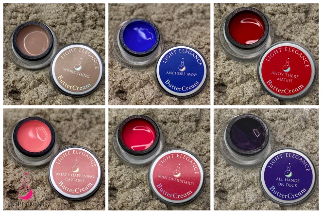
The first color in this collection is ahoy there, matey! This color is a soft cherry red. It is not a blue red, but it is more of a warm red without any orange tones. I love this red and I am not a huge red person. When ever I see this color I think of Cristina Aguilera singing Candyman in her sailor outfit and red lipstick. It is a very fun and poppy color. In the buttercream line we do have a good amount of reds that are all similar but different. So I will compare ahoy there, matey! to from left to right Poison apple, painting the roses red and real red. So as you can see Ahoy there is in my eyes the perfect red. Real red has more of a orange red tone while, poison apple is bright pink red. Painting the roses red is obviously is a deeper tone but I would say it is in the same family as Ahoy there.

The next color is called All Hands on Deck. This color is a dramatic deep purple cream. Now its not a heavy winter purple since it has an electric 90s vibe. I am glad to be seeing more purples especially complex purples. Right now in the buttercream line there are either plums, berries, muted or pastel purples. I have three colors to compare to All hands on deck they are Madam Mim, Edgar Allen per-poe and Finding Tranquility. Madam Mim and Edgar Allen per-poe both have pearl simmers and are way brighter then all hands on deck. Now finding tranquility is a deep, dark, creamy ink-blue. While all hands on deck is similar to this color and its application but in the purple family. They both have a nice and rich deep color. I would say with this color like other dark colors you may need more then one coat or a thicker coat to achieve perfect coverage. If applied to thin it can have a slight jelly look which is popular in the summer but wont show off this colors full potential.

My favorite color in the Nautical collection is Anchors Away. Anchors Away is a light creamy cobalt blue. Its a bright and electric blue with a touch of softness. When I saw this color I immediately put it on my toes with jimmygel and topped it with moon glitter gel. Anchors away is a great color its not to dark or light while still being poppy and fun. Now we do have a good amount of blues in the buttercream line but nothing like this. The only color i can compare it to is Justice. I would say that Anchors away is the beautiful blue shimmer in justice but in cream form. It is so beautiful and I am so happy to have a blue like this in the buttercream formula.

What is a summer collection without a pink! Man Overboard is a warm vibrant pink this is not a neon but it packs a pink punch. This creamy and sophisticated fuchsia is a beautiful pop for this summer. When I look at this color in the jar I feel like this is or is nearly the perfect Light Elegance logo pink. Pinks are an LE essential only a true LE girl will have if not all but a lot of different pinks. I have two buttercreams I can compare to Man overboard. Bold & beautiful and language of love are both darker and cool toned compared to man overboard. Language of love is more of a purple fuchsia pink while Bold & beautiful is a combination of man over board and language of love. From the photo comparisons you can really see how bright and neon Man overboard is making it perfect for summer.

The beautiful neutral of the collection is called Shore Thing. This cream natural beige has just the slightest hint of pink and amazing opaque coverage. Taupe and beige colors are beautiful neutrals to wear all year round and you can never have enough. I love that LE is expanding this type of color range. There are so many skin tones in the world and they are making sure that everyone has the perfect neutral for them. I have two colors to compare to Shore thing they are Udder Perfection and Your Churn. Udder perfection is a creamy vanilla nude, while your churn is a light nude mauve. Shore this is the closest to udder perfection but it is a little warmer with a touch of pink. On my very pale skin tone I prefer wearing Shore thing because of that touch of pink.

The final color in this collection is What’s happening, Captain? This is a light carnation coral with a white background making it soft and sweet for summer. For every bright and bold pink lover there is someone who loves a good soft pink. This is a beautiful soft pink for summer and spring. I have a few colors to compare to What’s happening captain? First comparing it to what in carnation from the spring collection. What in carnation is deeper and warmer compared to Captain. Flamingle isn’t to comparable since it is a brighter baby pink while boss lady is darker purple pink. Even all with all of the nudes we had gotten in previous collections. Noting truly compares to this color. It is one of those essential pinks that everyone needs in their collection.

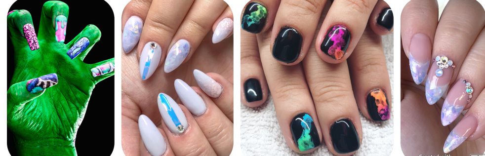
So here are my final thoughts on the Light Elegance Summer Nautical Buttercream collection. I am so excited to see Anchors Away and All hands on Deck. Like I had said in my summer collection review I was missing these colors. Little did I know we would be seeing them just in the amazing buttercream formula. Next I would say man overboard is my next favorite color. I am not a pink girl but this one is really great on toes and on the nails with a design on top. Ahoy there Matey is the perfect bright summer red, but I see myself grabbing this color a lot near Christmas as well. Shore thing is one of those colors that is extremely versatile. It is a great base for designs or just by itself as a nude color. I found myself grabbing this color a lot when I was doing designs for this collection as a neutral base. What’s happening Captain was the only color I had trouble with creating designs. I have a lot of clients who love this color just by itself. It is really pretty and a nice summer pink but i see myself using it more in the spring then summer in the future. Looking at my buttercream collection as a whole I am missing that yellow or mustard yellow. My ocd is wanting it all to be in a rainbow order and its missing that yellow in buttercream formula. So I am very excited to see whats in store for fall. My ideal fall collection would be mustard yellow, deep orange, forest green, raspberry red, a really deep pink, and a medium tone purple like Queen bee. Let me know your thoughts on this collection or if there are any colors you would like to see compared!

